Information scent makes both broad and deep information hierarchies work
Published May 25, 2026 • 9 minute read

By Austin Govella, digital strategist (and former information architect)
Since 1998, Austin has applied his information architecture skills for organizations big and small all across the globe. He co-authored Information Architecture: Blueprints for the web, 2nd edition with Christina Wodtke.
Key takeaway: Both breadth and depth impact how well users can navigate, however information scent, berrypicking, and visual hierarchy—how people interact with your hierarchy—impact the usability of your hierarchies just as much, if not more.
Both breadth and depth impact how well users can navigate, however information scent, berrypicking, and visual hierarchy—how people interact with your hierarchy—impact the usability of your hierarchies just as much, if not more.
Whether faced with a content-driven website or a task-driven application, the story starts the same way. You have a long list of things users need and have to figure out the best way to organize them. You have to make sense of this pile of stuff, so it makes sense to the people who need to navigate it.
It seems straightforward. Group similar things together and craft some labels. But, you face a choice: how many items do you show at the top level? Do you show more or less?
How do you deliver information hierarchies that people can navigate and are easy to maintain and evolve?
What we mean by flat vs deep information hierarchy
When you present navigation options to users, how many options do they see? And how many clicks does it take to find what they need? Whether you design apps or websites, if visitors have 30 options to choose from, and each option has a few sub-items, that's considered a wide, flat hierarchy. Many categories at the top. A few levels deep.
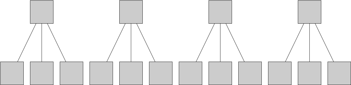
In contrast, if you have four options to choose from, and each of those items has sub-items, and those items have sub-items, that's considered a deep hierarchy. Few top-level categories. Many levels of subcategories.
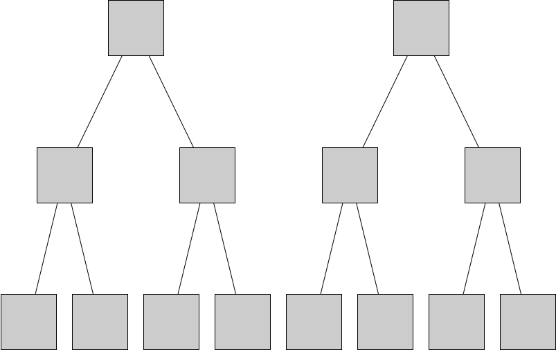
Users navigate moderate-breadth hierarchies fastest
In an influential 1981 study, Dwight Miller studied how well users navigated broad and deep hierarchies. Both extremely flat (one level of 64 choices) and extremely deep (six levels of two choices) lost to the middle configuration of two levels with eight choices each. Participants better navigated menus with eight items than menus with fewer items and more than two sub-levels (Miller 1981). Participants used broader hierarchies better than narrower hierarchies.
Researchers have replicated these results many times: moderate breadth beats extreme depth. (See Jacko and Salvendy 1996, Kiger 1984, Larson and Czerwinski 1998, and Zaphiris 2000).
However, there's a nuance to this finding. Miller measured speed and accuracy to find information (Miller 1981), and similar studies measured speed, ease of use, and user preference. But when people navigate your hierarchy, whether it's broad or deep, they don't want to navigate as quickly as possible. They want to navigate as effectively as possible.
(I've compressed 45 years of nuance into just a few sentences. Dive into the cited articles for detailed, informative recommendations on designing information hierarchies.)
Information foraging: is it worth the click?
Fifteen years later in 1995, Peter Pirolli and Stuart Card published “Information Foraging in Information Access Environments”. They argued that people decide whether or not to click on the next link based on:
the value of the information they expect to gain
versus the cost of performing the activity
Before users click on something, they ask themselves, is it worth the click (Pirolli and Card 1995)?
How do users decide it's worth the click? Users look for information scent. How well does the label communicate the link will get the user to the information they want (Pirolli and Card 1999)?
In a 1998 study, Larson and Czerwinski noted that some hierarchies "performed better than others because they had stronger scent for the target at the top levels of the hierarchy". In other words, the categories were easier to understand.
Thus, James Kalbach writes, "The optimal balance of a site's structure is related to the clarity of labels... the quality of link labels affects how well people can navigate structures of different depths and breadths" (Kalbach 2008).
Breadth and depth describe the hierarchy. Scent describes what users perceive. The two interact, but they don't compete.
That means breadth and depth don't matter if your links don't tell users what's behind them. And the corollary: users will click as long as they smell good information. Users click as long as the link seems worth the click.
Berrypicking and how information goals evolve
Besides speed, a second assumption hides in Miller's original study. Users prefer broader over deeper hierarchies when they know what they want to find.
This makes sense. Think about how we select states in the U.S. All state menus consist of a list of 50(!) options ordered alphabetically. When you select a state, you know what state you want to find. You can scan this menu with 50 items. Quick and easy.
But this isn't how people browse the web. When people browse websites and applications, they have a sense of what they want to find and will know it when they see it. So, their information goals evolve. Marcia Bates named this behavior, "berrypicking" (Bates 1989). In berrypicking, you navigate information spaces how you might pick berries. You find some berries on a bush that look ripe, and then, you spy some riper berries on a nearby bush, so you move to grab those berries. In navigation terms, what we look for evolves as we move through the information space and learn more about what's there.
So, when you look for something, you use information scent to know where to click. As you navigate, you learn more about the thing, so you evolve and change what you look for. So, the information scent you look for changes, and so on until you've accomplished your overall goal.
Let's say you work for a hospital who wants to hire a consulting firm to help with an ERP project. You find the firm's website and want to make sure they understand the healthcare industry and can solve your problem. You land on their website and see a typical homepage that doesn't tell you much. But, you see a link to "Industries" that you click on to see if they work in healthcare. On the industries page, you see healthcare and click there. On the healthcare page, you learn about their experience in the industry, but you see a link for "hospitals", so you click there. And on the hospital page, you see a case study on how they implemented an ERP for a regional hospital.
You didn't look for case studies about ERP systems in hospitals, but you found one, and that case study helps you evaluate this firm's ability to help your hospital.
At each stage, new information tantalized you with more relevant information scents, and you adjusted what you wanted to find based on the new high value link you see. Kalbach notes, "New information encountered sheds light onto the original problem, which itself changes and becomes compromised. Online information seeking is more like a negotiation between the seeker and the system" (Kalbach 2008).
Not only do user information queries shift. Links can shift too. They can move in and out of your hierarchy and change the calculus on what link is worth a click.
Surface links to shortcut deep hierarchies
Questions about broad versus deep hierarchies assume users navigate in a linear fashion, but hypertext can break that linearity.
For example, on our consulting firm website, in addition to a link to industries, you could list all the industries on the homepage. You haven't changed how your information is organized, but you've changed where the user sees the industries. You shifted where the link appears.
Personalization does the same thing. Say we know you work at a hospital, then we can show the ERP case study on the homepage. Why make you navigate four levels down to find it?
Search provides another shortcut. You might search for "hospital ERP" and pull up results that list the page for hospitals, a page on ERPs, and that same case study.
In each case information scent and berrypicking govern how users navigate your site to find what they need.
Use broad, shallow structures when users are more familiar with the system
The more "expert" your users, the broader your hierarchy can be. The word expert here means they're an expert at this interface. Think about how we choose U.S. states, again. Everyone in the U.S. has lots of experience choosing states from a list of 50, so you can show us the list of 50 and we know how to find the state we need.
Think about a dashboard for an application that you use everyday. You see the dashboard and its links everyday, so you become an expert in that dashboard and can have a broad hierarchy with lots of menu items.
For new sites or applications where you expect content and functionality to grow, "lean toward a broad and shallow rather than a narrow and deep hierarchy. This allows for the addition of content without major restructuring" (Rosenfeld, Morville, and Arango 2015).
Use deeper structures when users need to browse large content sets
For browse-oriented users, take advantage of deeper hierarchies to make information easier to find. Think back to our consulting site. The ERP case study lived four levels down (home > industries > healthcare > hospitals > case study), but the information scent increased as the user navigated further, so the depth worked to our advantage.
Ecommerce sites also manage huge content sets where additional levels of hierarchy help users narrow results down to manageable lists. Deep hierarchies with facets cut huge catalogs into navigable subsets.
Scent and scannability make any structure work
When you organize content and functionality, remember that breadth and depth describe the structure of your hierarchy, but scannability and information scent drive its usability.
Similarly, navigation structure combined with visual hierarchy "show the most notable effects on the usability of your interface" (Qiu and Zhang 2026). The visual design of your navigation system—do you make it easy to find, scan, and comprehend—works just as hard as the labels you use to navigate people to their target.
This means: when you design hierarchies, focus on groups you can slap with information scent heavy labels and use visual design to make that list easy to scan and comprehend. If you have a choice between broader or narrower hierarchies, consider a broader hierarchy. About eight items per level works for most contexts. Beyond eight, group with visual hierarchy or subheaders.
| User familiarity | Content volume | Scent strength | Structure |
|---|---|---|---|
| Expert | Any | Any | Broader |
| Novice | Small | Strong | Broader |
| Novice | Large | Strong at top | Deeper |
| Any | Large + browseable | Increases with depth | Deeper with facets |
Users will click as long as they detect a strong information scent; as long as the link seems like it's worth the click.
Next post: How to create sitemaps that stakeholders understand
Sources
Bates, Marcia J. 1989. “The Design of Browsing and Berrypicking Techniques for the Online Search Interface.” Online Review 13 (5): 407–24. https://doi.org/10.1108/eb024320.
Jacko, Julie A., and Gavriel Salvendy. 1996. “Hierarchical Menu Design: Breadth, Depth, and Task Complexity.” Perceptual and Motor Skills 82 (3_suppl): 1187–201. https://doi.org/10.2466/pms.1996.82.3c.1187.
Kalbach, Jim. 2008. Designing Web Navigation. O’Reilly Media, Inc.
Kiger, John I. 1984. “The Depth/Breadth Trade-off in the Design of Menu-Driven User Interfaces.” International Journal of Man-Machine Studies 20 (2): 201–13. https://doi.org/10.1016/S0020-7373(84)80018-8.
Larson, Kevin, and Mary Czerwinski. 1998. “Web Page Design: Implications of Memory, Structure and Scent for Information Retrieval.” CHI, April. https://www.microsoft.com/en-us/research/publication/web-page-design-implications-memory-structure-scent-information-retrieval/.
Miller, Dwight P. 1981. “The Depth/Breadth Tradeoff in Hierarchical Computer Menus.” Proceedings of the Human Factors Society Annual Meeting 25 (1): 296–300. https://doi.org/10.1177/107118138102500179.
Pirolli, Peter, and Stuart Card. 1995. “Information Foraging in Information Access Environments.” Proceedings of the ACM Conference on Human Factors in Computing Systems, May.
Pirolli, Peter, and Stuart Card. 1999. “Information Foraging.” Psychological Review 106 (4): 643–75. https://doi.org/10.1037/0033-295X.106.4.643.
Rosenfeld, Louis, Peter Morville, and Jorge Arango. 2015. Information Architecture: For the Web and Beyond. Fourth edition. O’Reilly Media, Inc.
Qiu, Yinong, and Qingfeng Zhang. 2026. “The Influence of Information-Hierarchy Interface Design on User Cognitive Load: An Experimental Study Based on Information-Feed Applications.” Asia-Pacific Journal of Convergent Research Interchange 12 (2): 375–400. https://doi.org/10.47116/apjcri.2026.02.26.
Zaphiris, Panayiotis G. 2000. “Depth vs Breath in the Arrangement of Web Links.” Proceedings of the Human Factors and Ergonomics Society Annual Meeting 44 (4): 453–56. https://doi.org/10.1177/154193120004400414.